Lemon Festival
Visual Identity Design
Medium: Digital Print
Projects: Poster, Program
Timeline: Sep 2021 - Dec 2021
The Lemon Festival (Fete du Citron) is a carnival event held at Menton, France every year at the end of winter in mid-February. It is the second-largest winter event on the French Riviera, which spans over 15 days and attracts more than 200,000 visitors every year.
The challenge for this project is to establish a visual identity for a current existing festival and the chosen environment is The Lemon Festival.

Project Statement
My ultimate goal is to broaden the current local audience group, while promoting the festival to an international scale. By revamping the festival’s brand image with playful illustrations and bold typography, I want to convey the festival as a fun and creative event that is suitable for people of all ages such as parents and children, but especially individuals who are interested in arts and crafts activities.

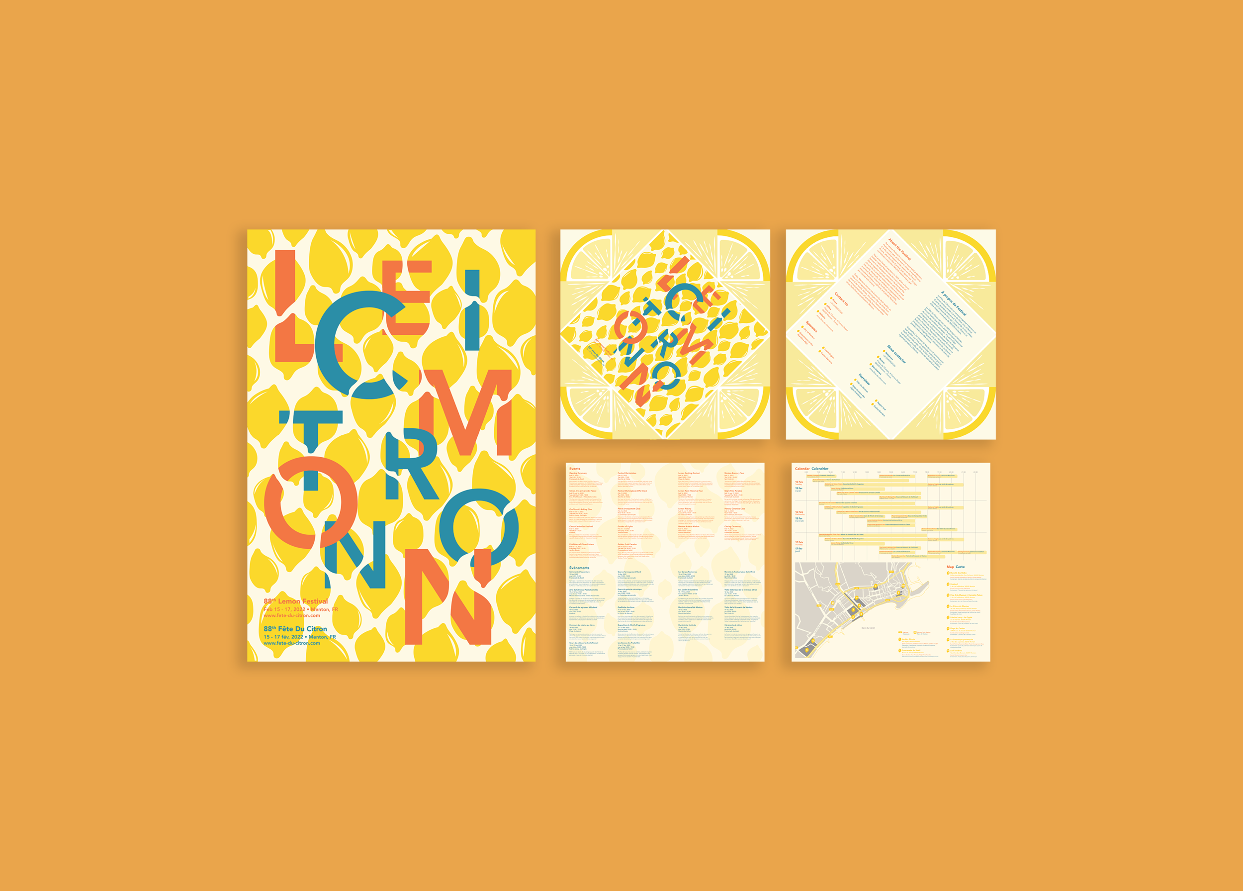
Poster (20” x 30”)

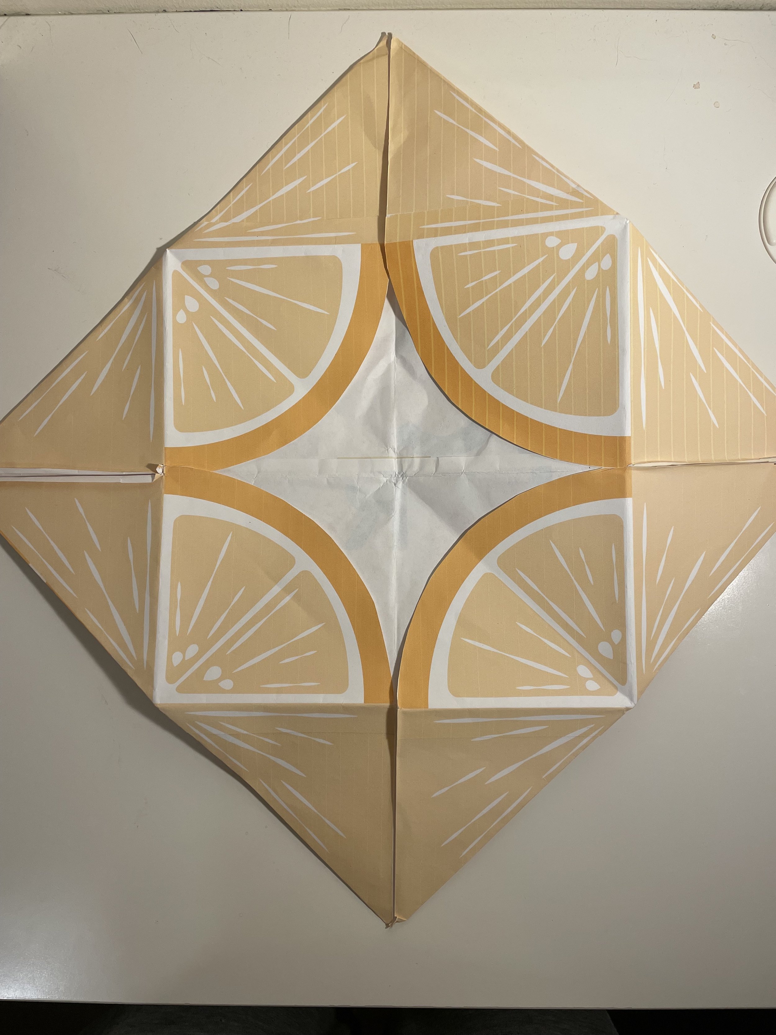
Program Cover (18” x 18”)
Left: Front Cover
Right: Back Cover

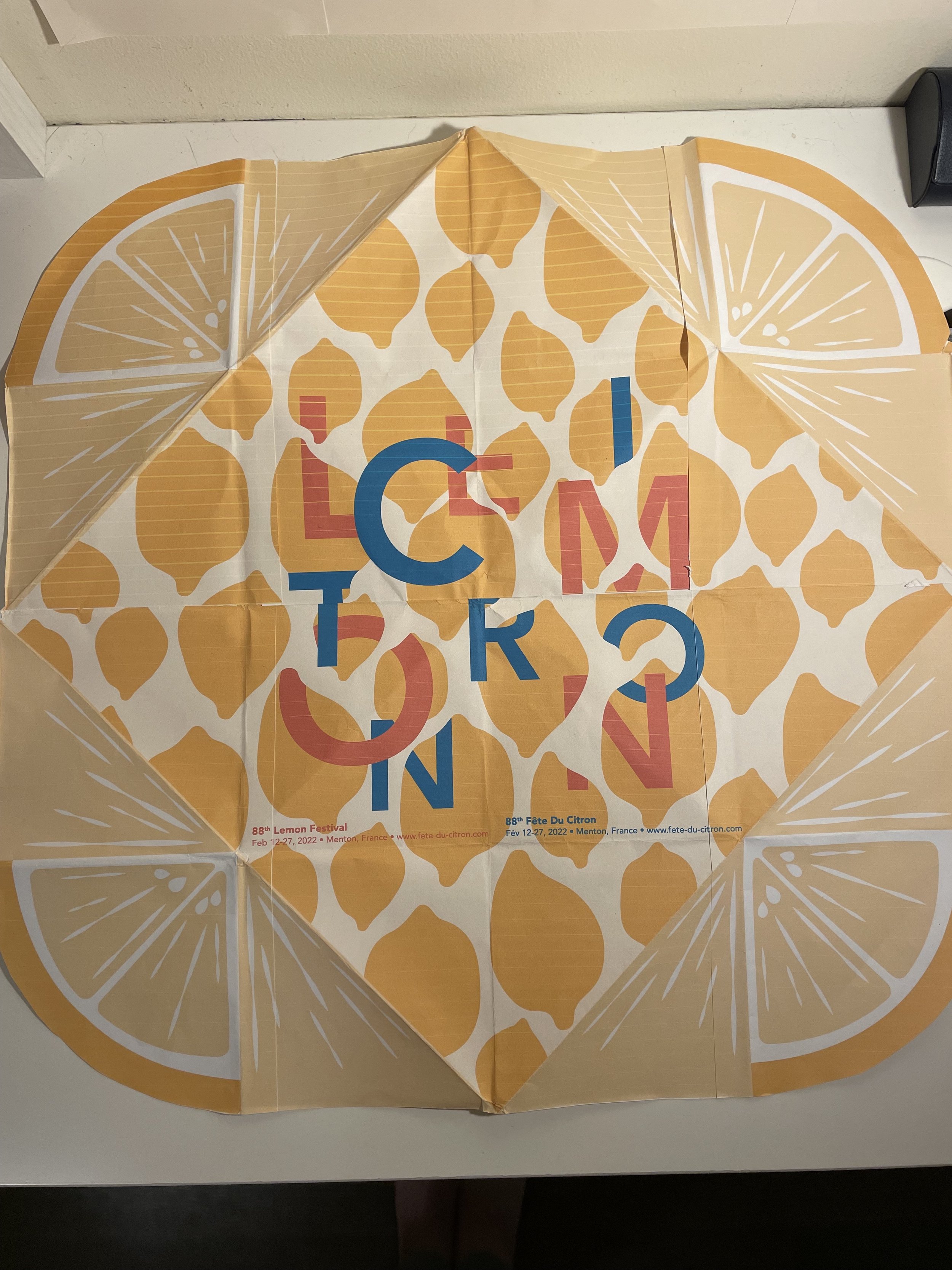
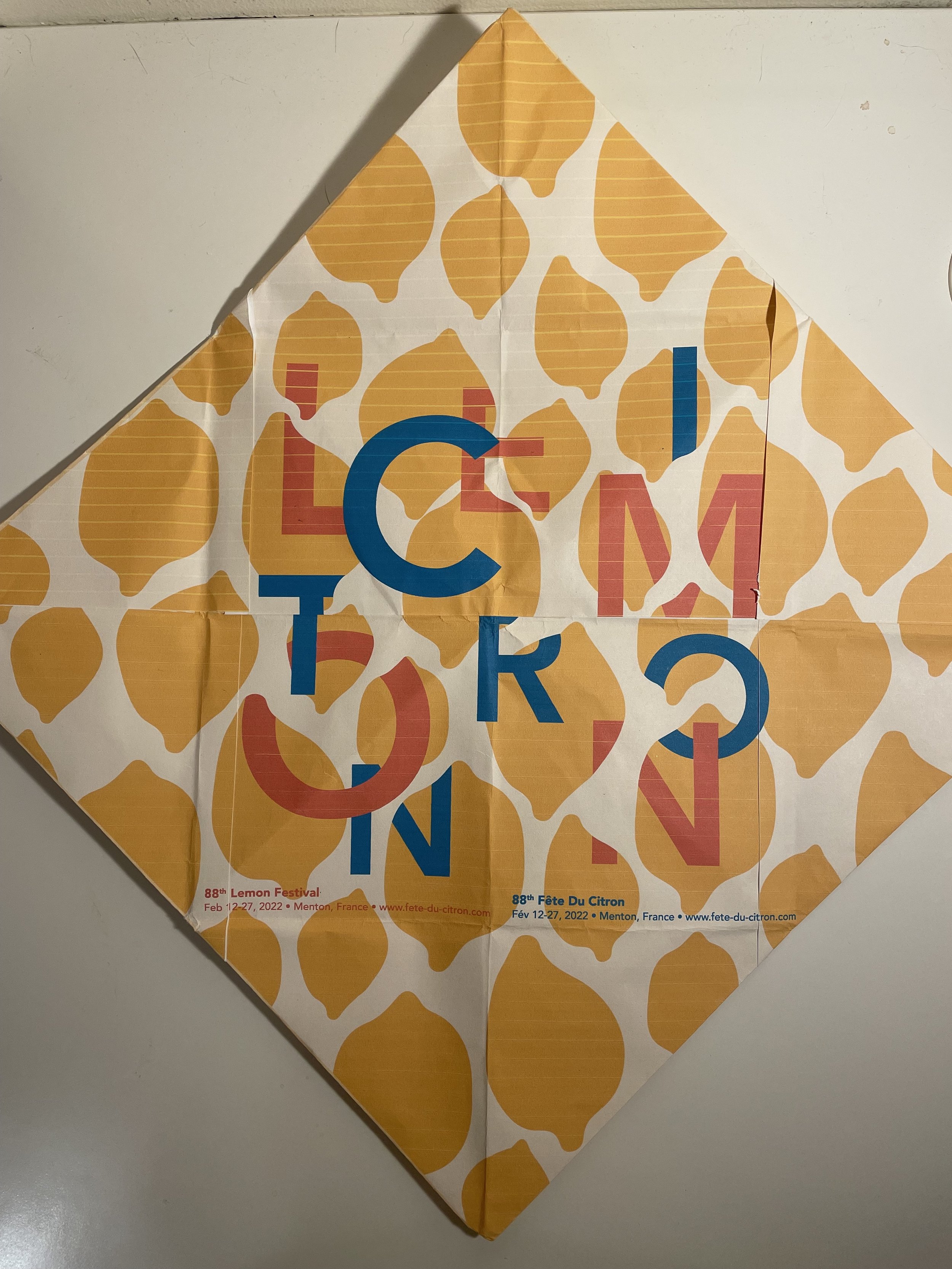
Program Content (17” x 17”)
Left: Event Listing
Right: Calendar and Map

Photo Credits to: Paxton Chan
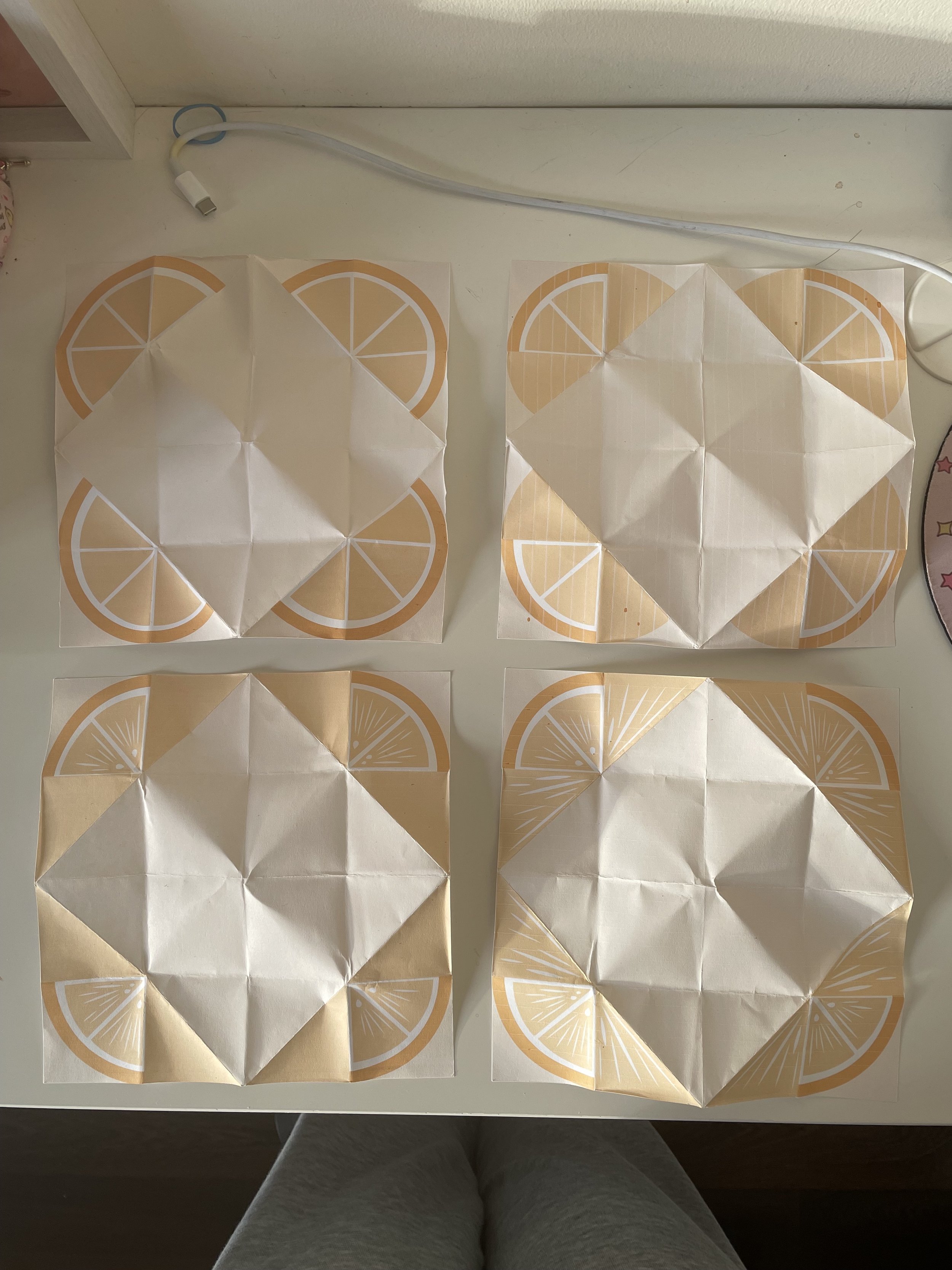
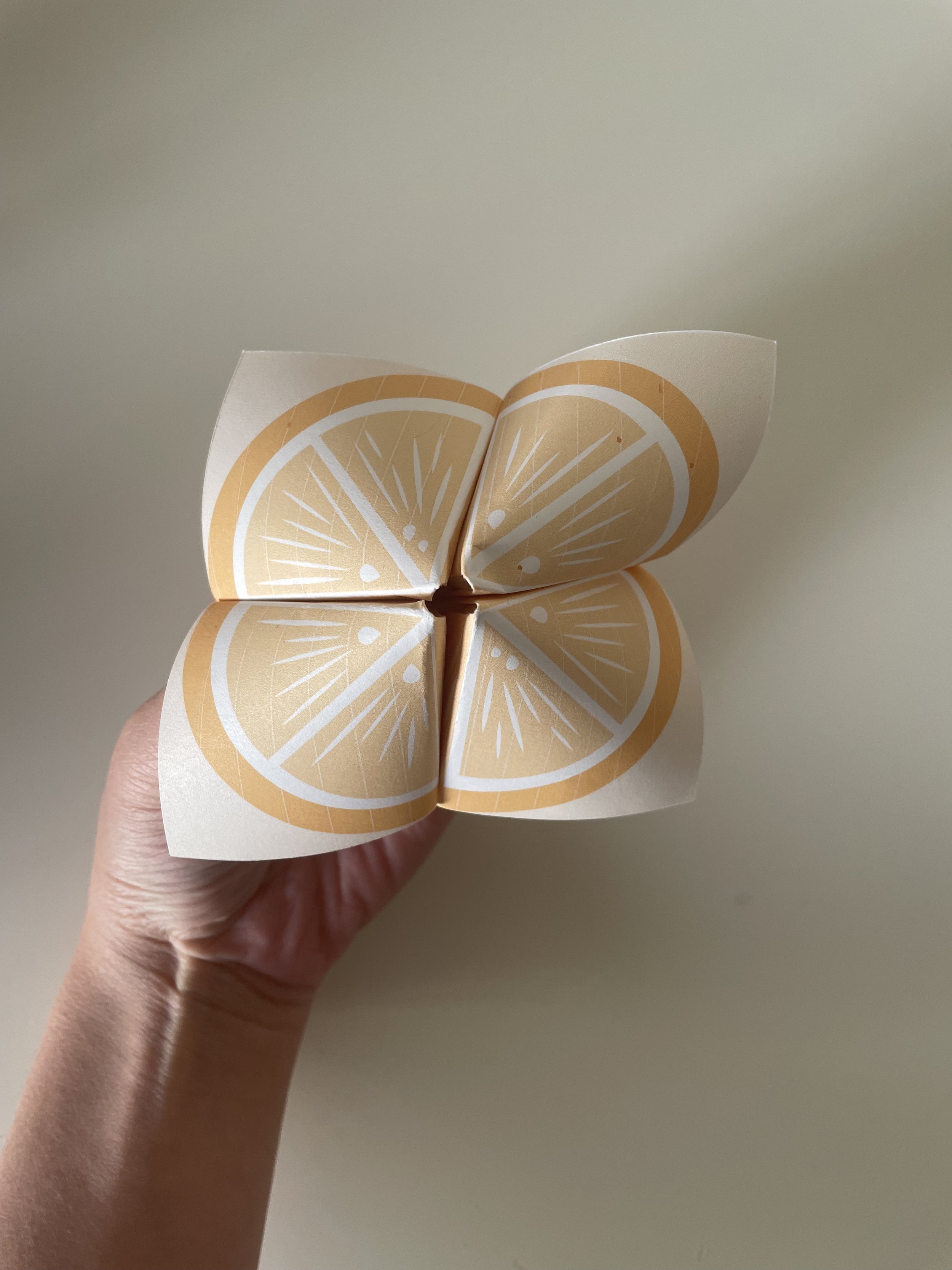
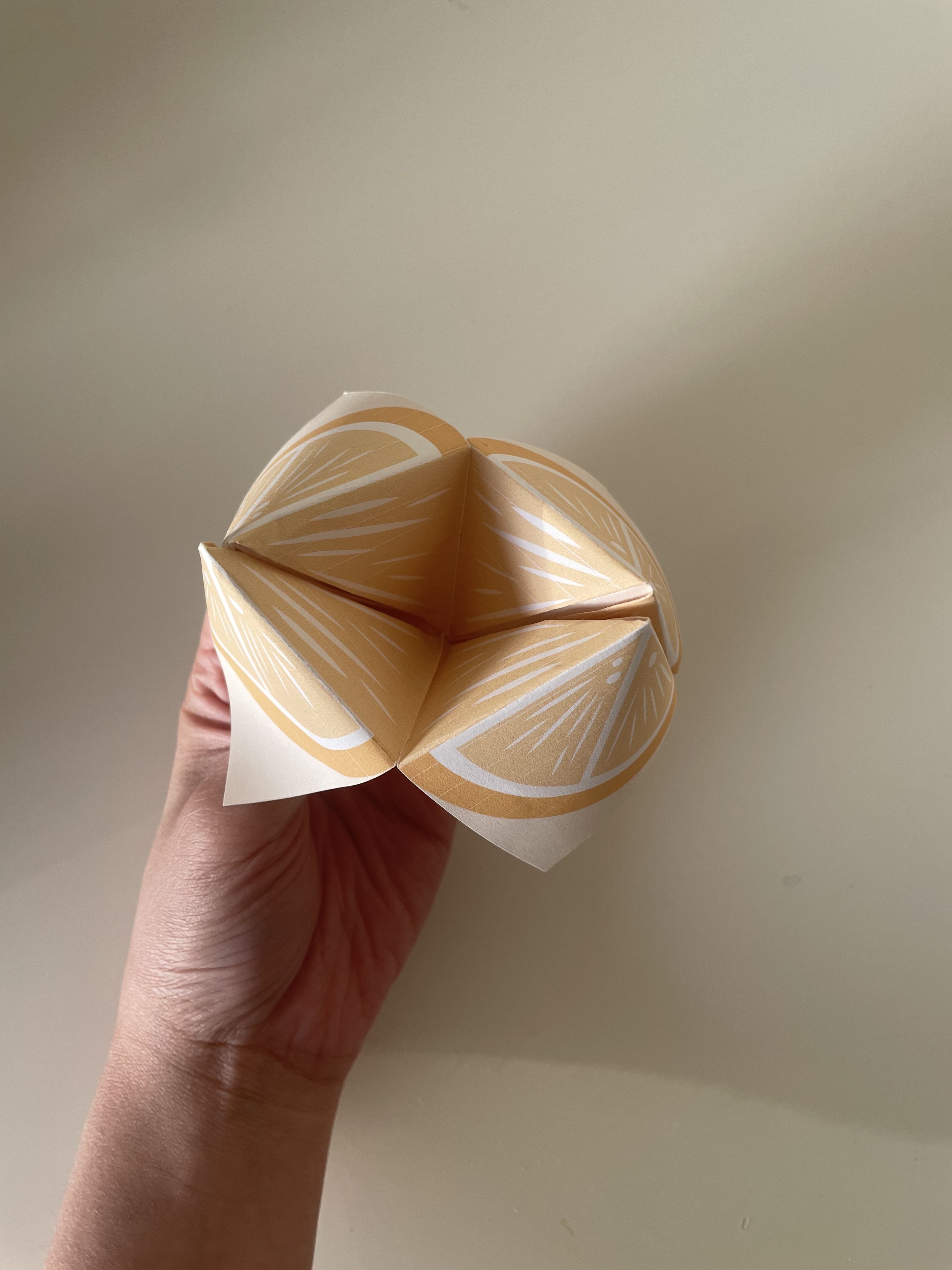
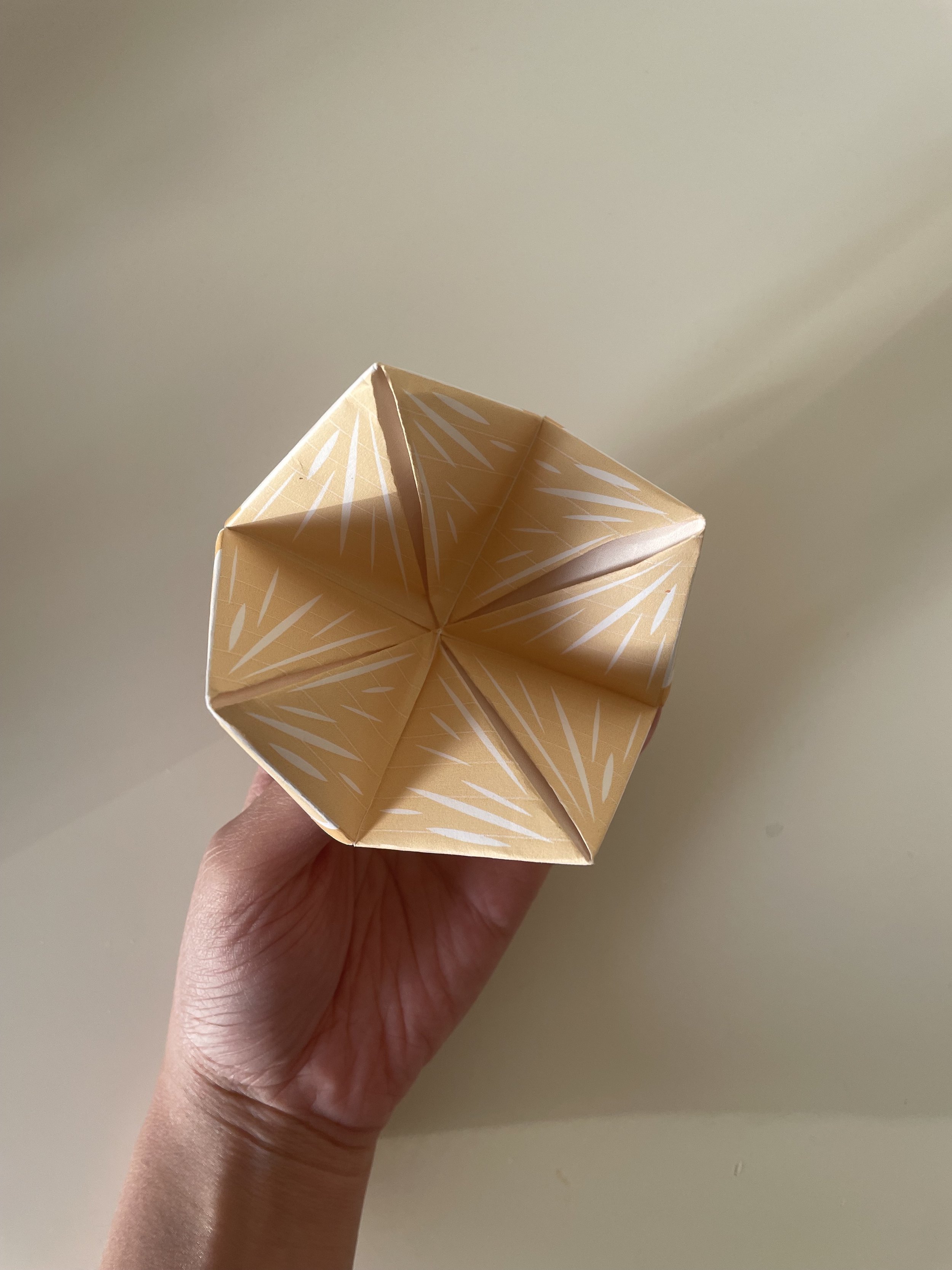
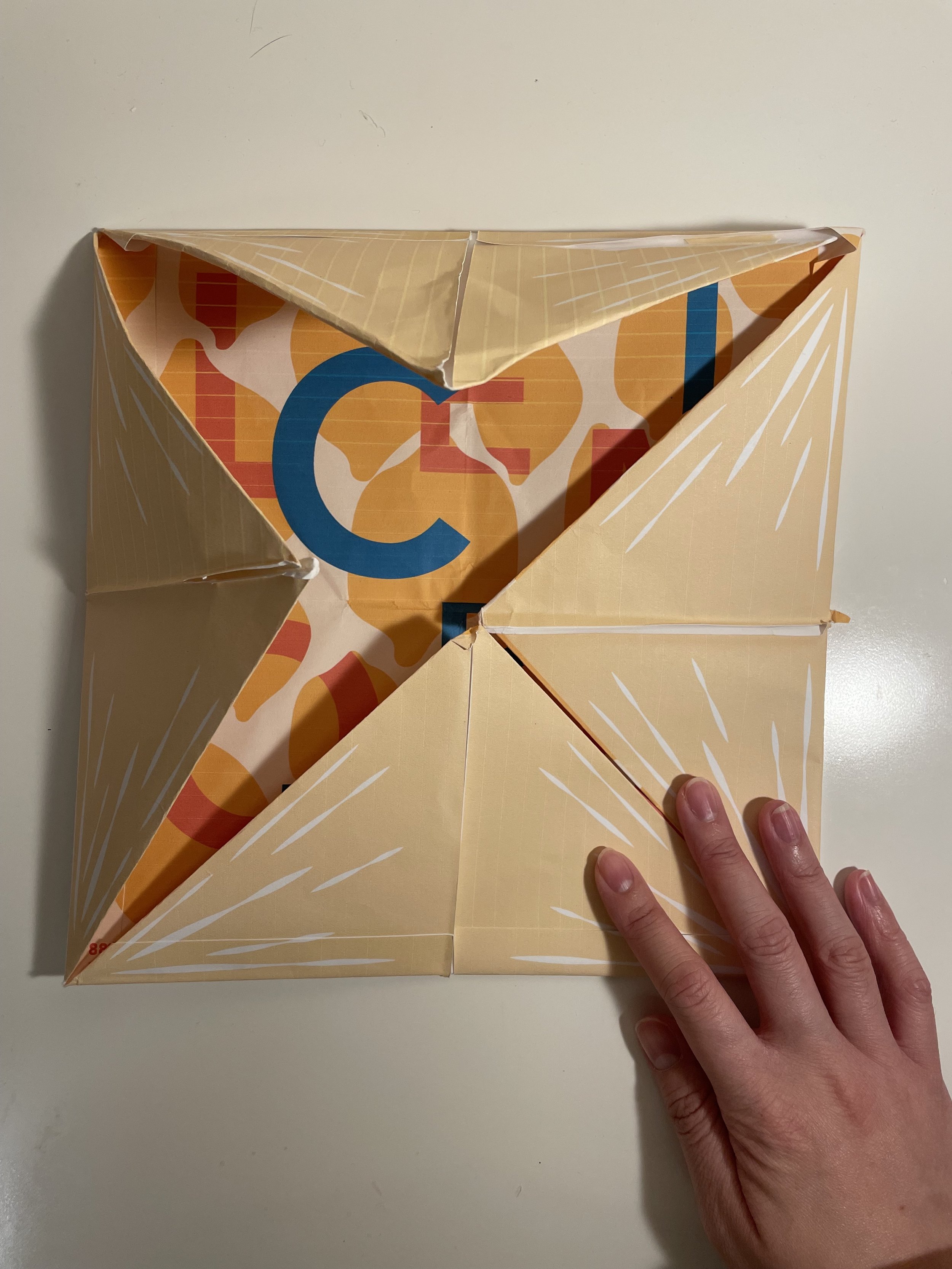
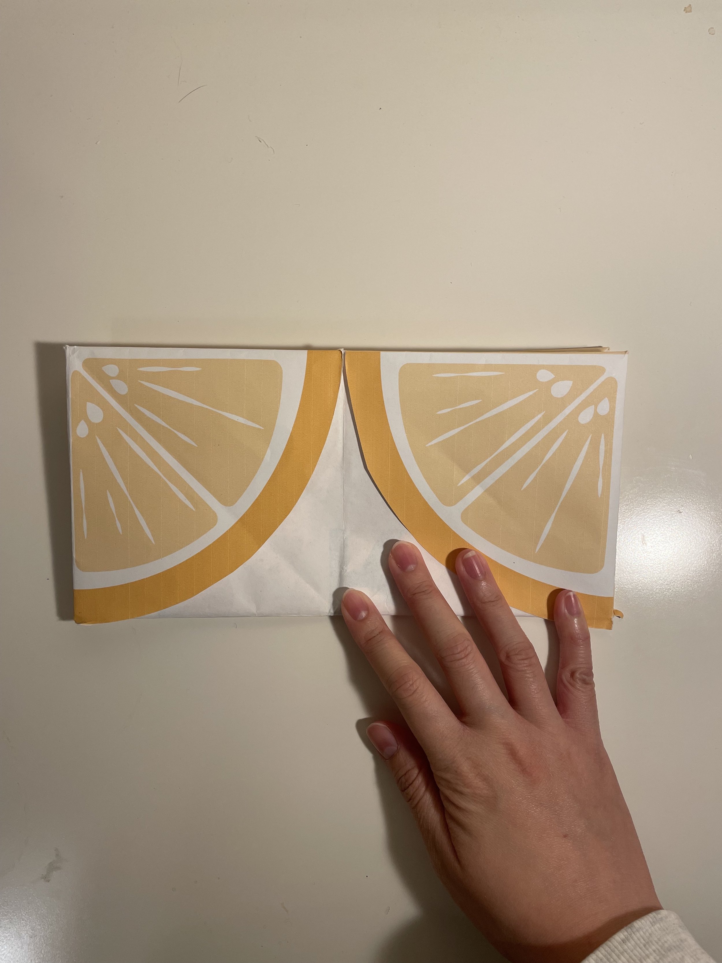
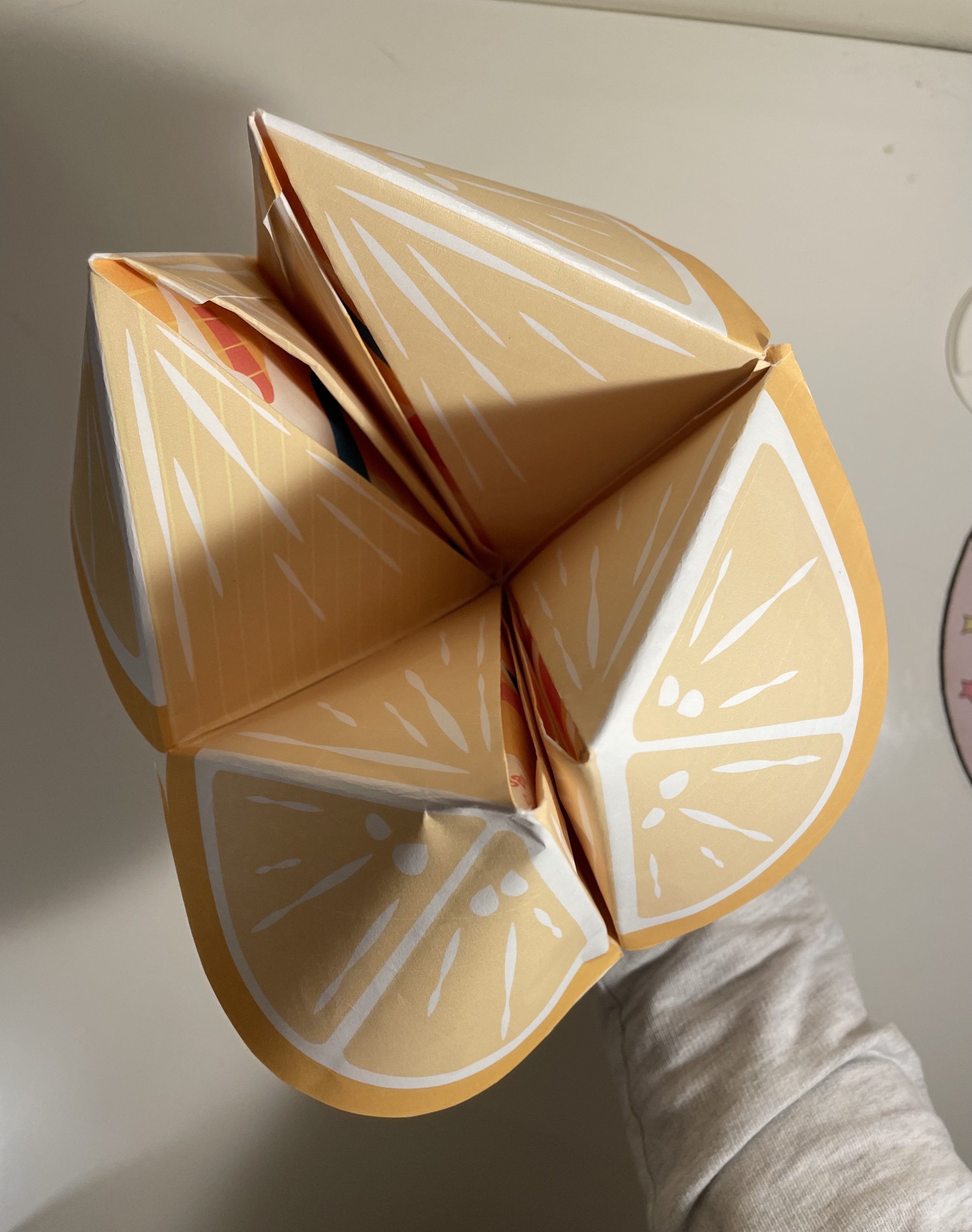
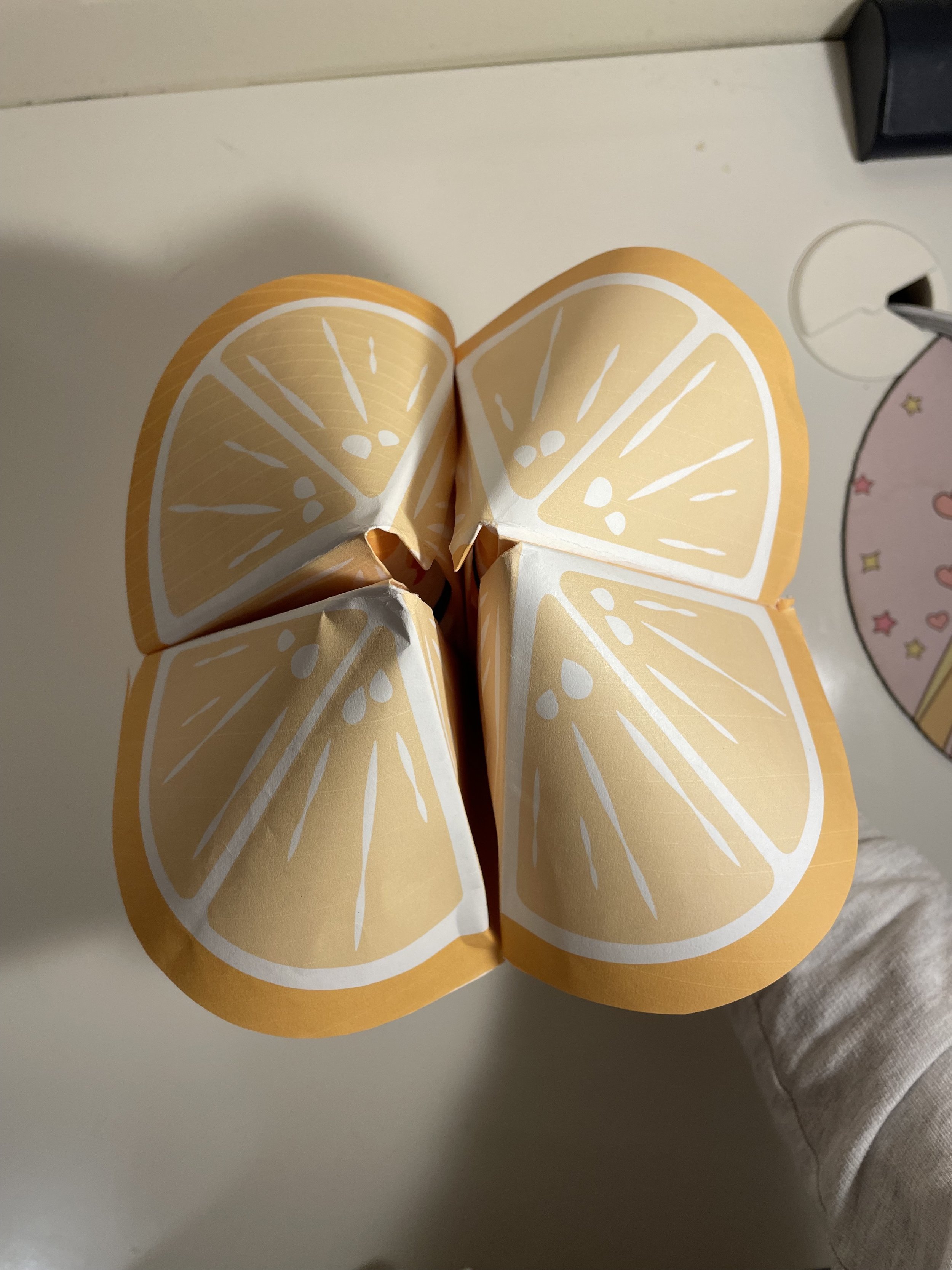
Folding the Program
The program has two parts: the cover and the content. It is designed to be folded into the form of a lemon, which is inspired by the folding technique of a paper fortune teller. After folding the corners of the cover, the content can be quarter-folded to be placed inside the cover.
Process Documentation: Poster


Left: Abstract mode of communication. Center and Right: Type-As-Image mode of communication
I came up with three different directions for the poster design. Each direction follows a mode of communication. All poster shares the same concept of how the festival’s parade floats and sculptures are created: by binding tonnes of lemons together with rubber bands.


Final Poster
My final poster design for the Lemon Festival is communicated in the type-as-image mode.
The lemon-patterned background in the poster is inspired by the way the festival’s parade floats and sculptures are created: by binding tonnes of lemons together with rubber bands. However, the emphasis of the design is on the type treatment for the words ‘Lemon’ and ‘Citron.’ In order to create a sense of connection between the lemons and the typography, some parts of the letters are designed to go in and out of the lemons, which also gives more layering to the design.
The colour palette contains only four colours: cream, yellow, red and blue. Covering the majority of the poster is the bright yellow colour for the lemons, which aims to give out a sense of vitality. On the other hand, the red and blue colours are chosen to represent the festival’s information in English and French respectively. The overall goal for the colour palette is to create a dynamic relationship between the type and the illustrations, as well as to convey a fun and energetic feeling to the audience.
Process Documentation: Program


Program Cover
While designing the program cover, I was constantly struggling with trying to match the interior (the part with the typography and the overflowing lemons) and exterior (the lemon skin) of the design. Even though I tried using different lines, shapes or colours to decorate the exterior, the design still looked odd and mismatched.
Eventually, I took my professor’s advice to revisit the poster and redesign the lemons there.
I did a few test-printing on 8.5” x 8.5” papers to make sure I understood how the lemon on the cover should be designed and folded.
I did a second round of test-print with a design draft.


Program Listing
One of the early obstacles I had when designing the program listing was trying to fit 18 events (English and French respectively) on a 17” by 17” squared paper. I had to revise the page layout multiple times in order to create the most appropriate grid system.
Eventually, I settled with an 18 column grid, which had given the design a lot more breathing room and also made it more clean-looking than the previous 13 column grid.
